Case Study: Rebranding Innotech Integration
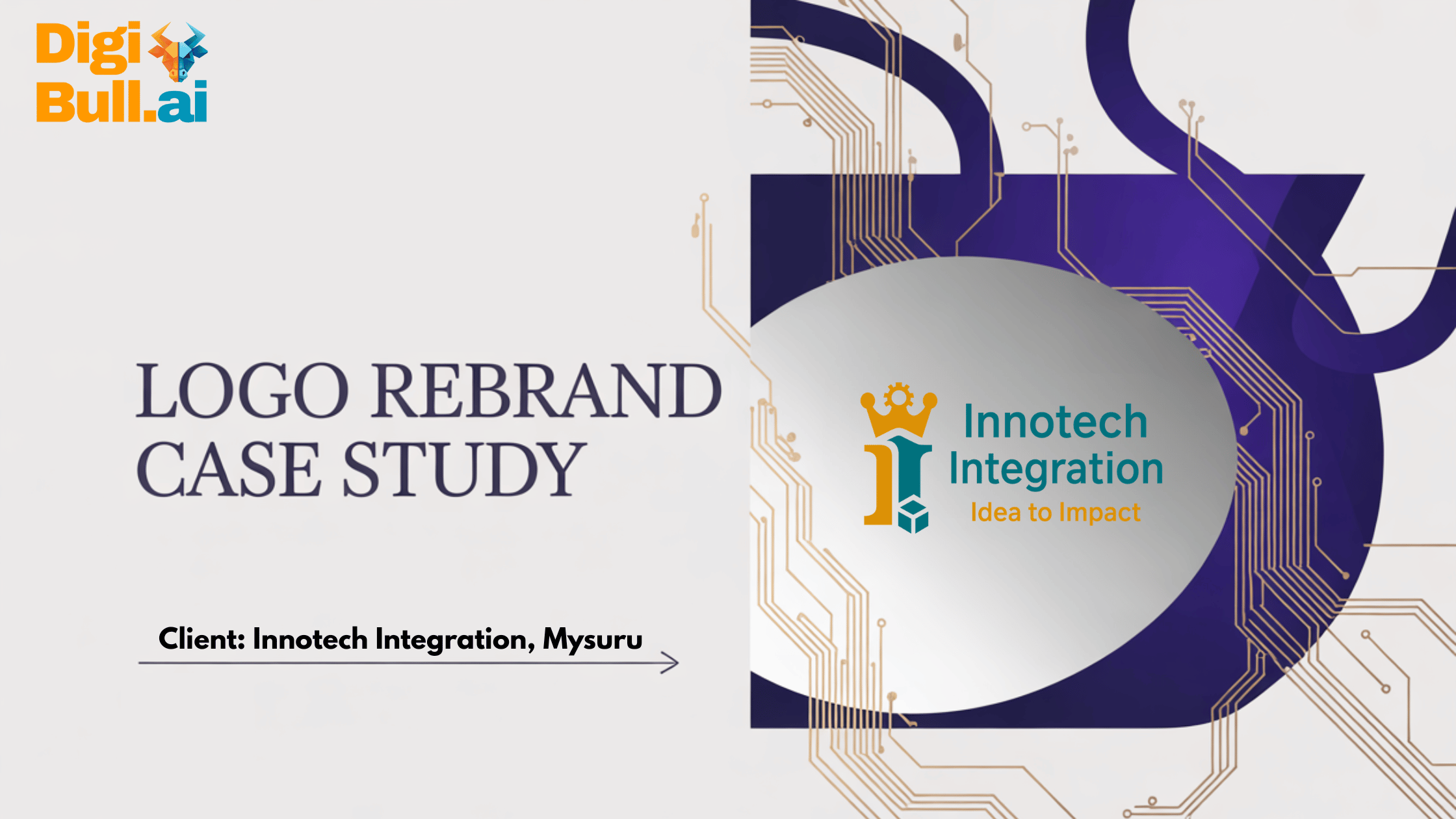
The Client Innotech Integration Services Pvt Ltd. is a startup with two manufacturing units in Mysuru, Karnataka. Their services include box build, cable assembly, new product design, and product integration and testing. Opteamize Cloud Solutions in Chennai has contracted with Innotech to provide digital marketing services like SEO and Website Management. The Opteamize team had already tried its hand at improving the client’s logo. See the old logo and their version of the new logo below. However, the client was not satisfied with the logo tweaking by Opteamize and was wedded to the electronics concept. Opteamize has also partnered with DigiBull AI to provide AI-powered marketing services and solutions to many other clients. Opteamize then turned to DigiBull AI, and we got a very unique requirement from them: “Can you use AI to rebrand our client’s logo and tagline?” Despite using AI for building marketing strategy and lead scoring for our clients, this was still an unorthodox requirement, but well worth looking into! After all, look at the quadrant of services we provide. We understood that the context was to refresh the client’s identity to better resonate with US B2B buyers while preserving brand equity. The Challenge The existing logo (and tagline), while having an electronics look and feel, was distinctly vague and struggled to be clearly noticeable when shrunk. It also lacked a vibrant appearance on labels and the website favicon. We first used AI to perform an honest critique of the revised Innotech logo designed by Opteamize to see what could be improved: Here was the feedback from ChatGPT (GPT-5) Small-size performance: The intricate pipe details and smiley may blur at favicon/business-card size. Consider a simplified micro-mark for ≤24px. Weight balance: The icon feels heavier than the wordmark. Slightly reduce icon size or increase word weight to balance. Kerning & rhythm: The double “nn” and “ot” could use subtle kerning tweaks for smoother spacing. Tagline contrast/scale: On some displays, the tagline may read light; bump weight/tracking or contrast a notch. Single-color use: Ensure the icon reads in 1 color/black for stamps, laser engraving, and embroidery. Some inner gaps may close up. However, we felt that even with the help of AI, we could only marginally enhance the revised logo due to the inherent problems with the design. Hence, our design team said that if given a free hand, they could come up with completely new options. The client was, however, very much attached to the logo and was unwilling to change it unless there was strong evidence that a new mark would signal precision, reliability, and leadership. Luckily, we were able to convince the client to give us a chance. Our Approach Because the logo is critical to the client’s history and reputation, any change was expected to positively impact the attributes that matter most to US procurement teams evaluating box-build partners. The DigiBull AI Team, headed by Sriniketh Srinath, sat down with the Opteamize design team and client to agree on success criteria. Four things about the logo and tagline came up during the discussion with the client: The redesigned logo must be clearly associated with the existing business (box build and cable assembly). Have a strong connection with the royal city of Mysuru. Have a modern and trendy look that US buyers could identify with. The tagline (passion for innovation) would then be rewritten to reflect the newly minted logo. Our team (with the help of GPT-5) developed three distinct creative routes to test positioning: The Animal route, “Falcon Precision,” used PCB-inspired lines to suggest speed and accuracy. The Royal route, “Emperor,” centered on an “ii” monogram topped with a crown-gear, paired with rounded-humanist typography for warmth and trust. The Box-Build route, “Modular Cube,” featured an isometric cube of interlocking PCB plates with a vertical trace forming an “i.” Notes are from GPT5 Animal Theme Royal Theme Box-Build Theme Falcon Precision Imperial Mark (Emperor) Modular Cube Idea: A stylized falcon head built from PCB traces and a micro-connector beak. The negative space between the neck/crest forms a subtle “i”. Symbolism: speed, accuracy, high-acuity vision → perfect for precision assembly & testing. Style: Minimal, single-weight strokes with rounded corners (no feathers). Works in 1 color. Palette: Teal #00A8B8, Navy #0A1F33, Neutral #F5F7FA; highlight #FF7A00 (sparingly). Typography: Geometric sans (e.g., Montserrat, Sohne, or Avenir Next); Medium for wordmark, Regular for tagline. Lockups: Icon-left horizontal + stacked; favicon = falcon eye + trace curve. Motion (optional): A faint “signal” traveling along the falcon trace. Idea: A modern crown made of three gear-teeth/castellations atop a vertical scepter-like “I”; a tiny bolt head appears in the crown’s negative space. Symbolism: leadership, reliability, mastery of complex builds; “crowned” quality. Style: Solid shapes (no outlines) for strong print/emboss/engraving; minimal details to avoid cultural/religious cues. Palette: Regal Teal #009FB2, Gold #C9A227, Charcoal #1E2227; 1-color charcoal for stamps. Typography: Humanist sans (e.g., IBM Plex Sans, Inter); tighten tracking for premium feel. Lockups: Monogram “II” (Innotech Integration) under crown for premium variant; full wordmark for general use. Finish (print): Spot-gold foil for crown or metallic Pantone; define non-foil flat variant. Idea: Isometric cube of three interlocking PCB plates with visible board-edge cutouts; front face carries a vertical trace shaping an “i”. Symbolism: enclosure assembly, harness integration, end-to-end ownership. Style: 2.25× stroke for icon vs 1× for letterforms; 8px corner radius for all internal angles to feel engineered, not clip-arty. Palette: Deep Navy #0A1C2E, Process Teal #01B0C8, Steel Gray #5A6772, White outline for dark backgrounds. Typography: Tech-friendly grotesk (e.g., DIN Next, Rubik). Lockups: Exploded-view variant for presentations; solid cube for small sizes; favicon = single cube corner with the “i” trace. Motion (optional): Faces snap together; the connector dot “clicks” in. Each logo was then evaluated and reviewed through the lens of US buyer expectations. The Decision After side-by-side testing, the client selected the Royalty logo. It projected executive presence via the crown, established a strong and timeless connection with Mysuru, and had the bonus of the double “i”, representing Innotech Integration. It was a comprehensive … Read more